Review · Tools of the trade
Photoshop for Posters and Social Media Posts: Where It Wins, Where It Doesn't, and How to Export
 By Kashif RehmanPublished 17 September 2026Updated 17 September 20269 min read
Short answer
Photoshop is the best tool I use for photo compositing, retouching, mockups and finishing social media posts. It is the wrong tool for logos, long print type and panaflex-size layouts. The workable routine is to build type and vector parts in CorelDraw or Illustrator, then bring them into Photoshop for image work and final social exports.
Most people in Pakistan call every design program "Photoshop". Clients ask for "a Photoshop poster" when they mean anything designed on a computer. In practice Photoshop is a pixel editor with very good type and layout features added on top, and knowing where those limits sit saves a lot of reprinting and rework. This review covers where I reach for it, where I refuse to, the export sizes I use for social platforms in 2026, and how files move between it and my vector programs.
Where does Photoshop clearly win?
Photo compositing
When a poster needs a person cut out of a phone photo, a new background, a light glow behind them and a shadow that makes it all sit together, nothing in CorelDraw or Illustrator comes close. Select Subject, Select and Mask for hair, layer masks, adjustment layers and blend modes are the core of that work. Generative Fill and Remove help with extending a background or cleaning up a stray object, although I still check every generated edge at 100% zoom because it often gets hands, text and patterns wrong.
Retouching
Organisations send portraits of speakers, principals and guests taken on phones in poor light. Photoshop is where I fix exposure, colour casts, skin blemishes and distracting backgrounds before the photo goes anywhere near a poster. A portrait retouched in Photoshop and placed in a CorelDraw layout prints better than the same untouched photo.
Social post finishing
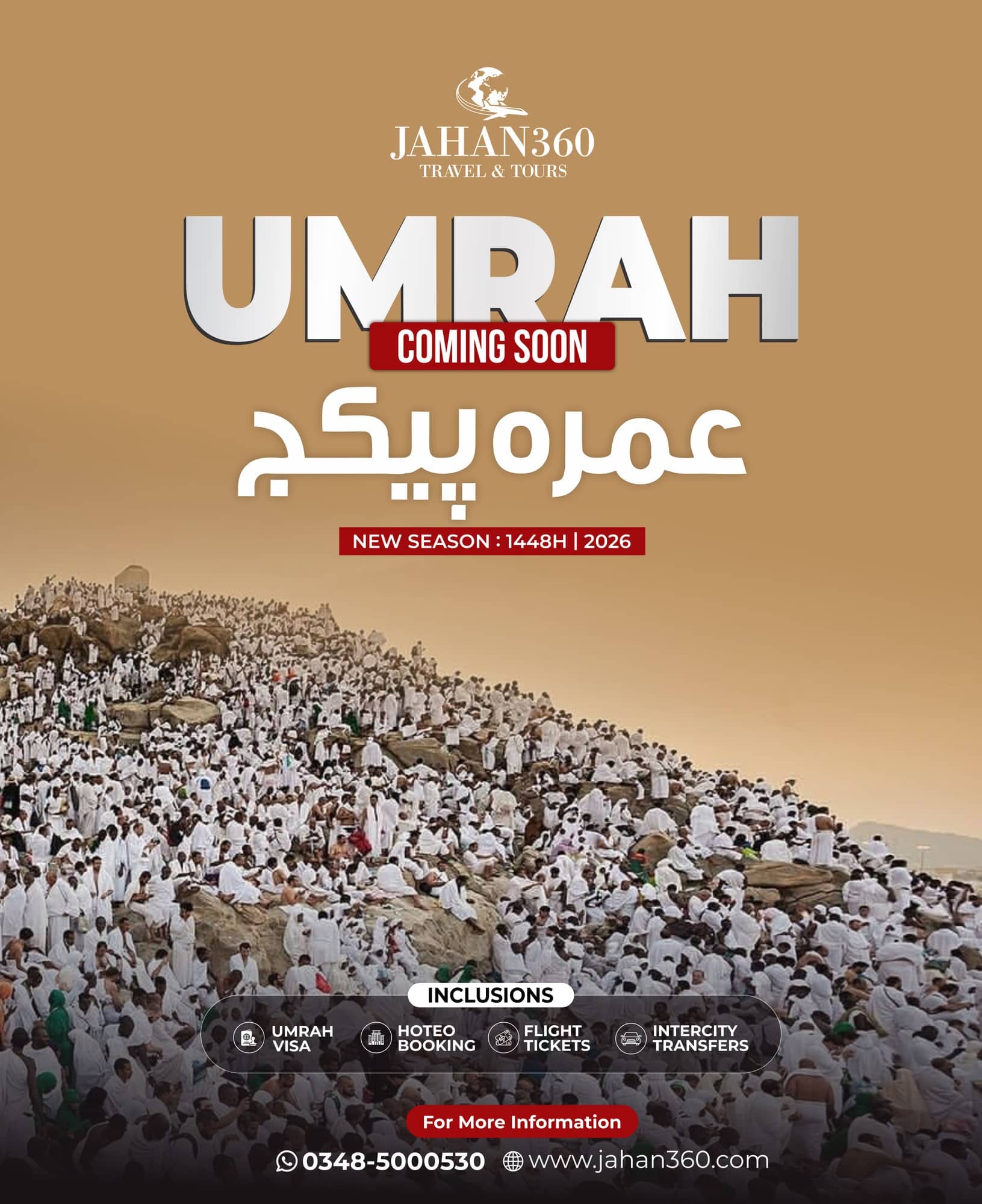
Social posts are viewed on phones as RGB pixels, which is exactly what Photoshop is built for. Final colour grading, texture, grain, sharpening for small screens and the actual export all happen there. For campaign work like the Quaid-e-Azam Day poster for 25 December, the finishing pass in a pixel editor is often where a flat layout starts to feel finished.
Mockups
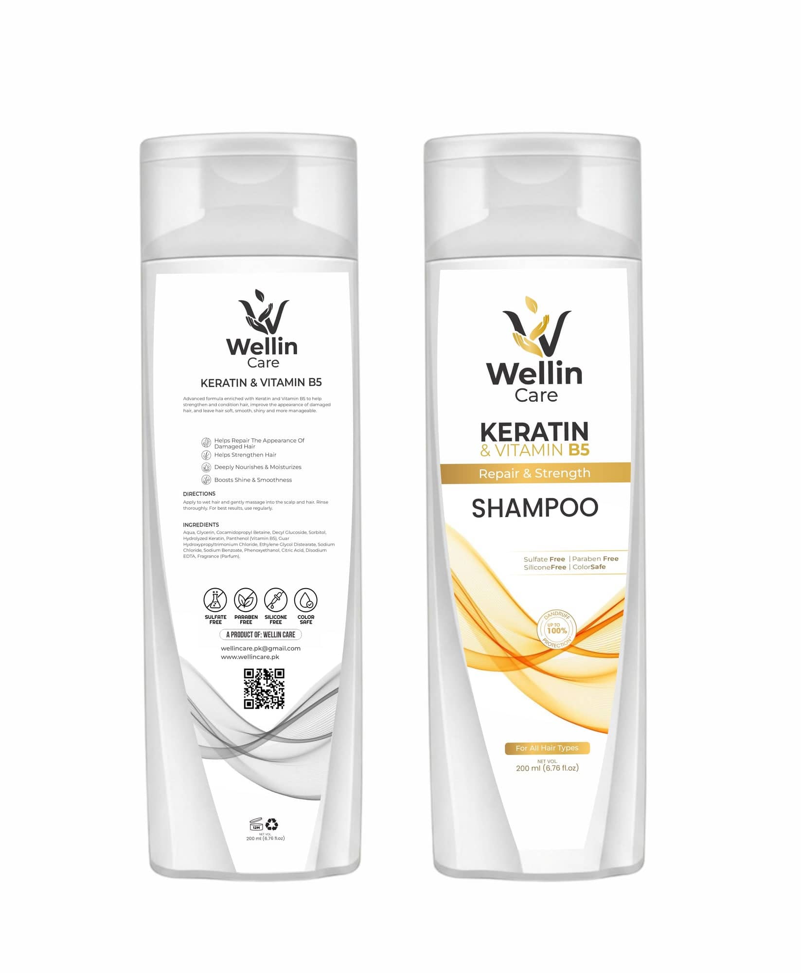
Showing a client their shampoo bottle on a shelf or their letterhead on a desk is a Photoshop job. Smart Objects let you drop flat artwork into a perspective mockup and update it in seconds. I use mockups for approvals because clients judge a design far better when they can see it as a physical object.
Where does Photoshop lose?
Logos
A logo in Photoshop is a grid of pixels. Enlarge it for a stage backdrop and the edges go soft. Printers and embroidery or signage vendors need vector files. Logos belong in Illustrator or CorelDraw.
Print type
Photoshop's type layers stay vector inside a PSD, but most print exports flatten them to pixels. Small body text on a brochure, a letterhead or a wedding card then prints with slightly fuzzy edges and can pick up a colour fringe if it isn't pure black. Multi-page layouts, paragraph flow and Urdu text on a long document are all easier and safer in a vector or layout program.
Panaflex scale
A 20 x 10 ft panaflex at a generous resolution becomes a huge raster file that slows laptops and the printer's RIP machine. Local shops also can't edit a flattened PSD when the client wants a phone number changed at the counter. For large formats I build the layout in CorelDraw, place only the images that need to be raster, and send a CDR or PDF.
What sizes should social posts be in 2026?
Platforms change their layouts often, so treat these as working sizes for September 2026 and check in the app before a big campaign.
Social export sizes I use (September 2026)
| Placement | Size (px) | Ratio | Notes |
|---|---|---|---|
| Instagram feed, portrait | 1080 x 1350 | 4:5 | Safest default for posters |
| Instagram feed, tall | 1080 x 1440 | 3:4 | Matches the newer 3:4 profile grid |
| Instagram feed, square | 1080 x 1080 | 1:1 | Still works, gets cropped on the grid |
| Instagram and Facebook Stories | 1080 x 1920 | 9:16 | Keep text out of the top and bottom 250 px |
| Facebook feed, portrait | 1080 x 1350 | 4:5 | Same file as Instagram usually works |
| WhatsApp status | 1080 x 1920 | 9:16 | Heavy compression, use large type |
A few points that matter more than the numbers:
- Instagram's profile grid shows posts in a taller 3:4 crop. A 4:5 poster loses a little at the top and bottom on the grid, so keep headlines and logos inside the middle area.
- Facebook and Instagram crop differently in previews. When one file has to serve both, design at 4:5 and centre the important content.
- For school, event and organisation work in our area, WhatsApp status is where a lot of people actually see the poster. It is also the harshest on quality. Thin Nastaliq strokes over a detailed photo turn to mush, so give Urdu headlines a solid or softly blurred background.
How well does Photoshop handle Urdu text?
Better than its reputation, once it is set up. In Photoshop's Type preferences, choose the Middle Eastern and South Asian text engine, restart, and the Paragraph panel then offers right-to-left direction and the matching composer. With a Unicode Nastaliq font such as Jameel Noori Nastaleeq or Noto Nastaliq Urdu, letters join and dots sit correctly in most headlines.
Two cautions from real jobs. Urdu pasted from WhatsApp or a Word file sometimes carries hidden direction characters, so if a line jumps around, retype the last word. And a PSD with live Urdu text that opens on a computer without the same font will substitute it silently, so rasterise or convert the headline to a shape layer on the final version and keep a live-text copy for edits.
Which export settings work best?
For social posts I use File, Export, Export As, rather than the old Save for Web dialog, and these settings:
- Colour: work in RGB and tick Convert to sRGB. A file left in Adobe RGB or CMYK looks washed out on phones.
- Format: JPG for photo-heavy posts, at quality around 80 to 90. PNG for posts that are mostly flat colour and text, since JPG adds visible blocks around sharp letters.
- Size: export at the exact pixel size of the platform. Uploading a much larger file hands the resizing to the platform, and its resizing is rarely kinder than Photoshop's.
- Sharpening: a light Smart Sharpen on the image layers, not the type, before export helps photos survive compression.
- Metadata: set to None or Copyright only, which keeps file size down.
Checklist
Before posting a campaign graphic
- Canvas matches the platform size exactly
- Headline and logo inside the central safe area
- Urdu text checked by someone who reads Urdu
- Exported as sRGB, JPG or PNG chosen for the content
- Viewed on an actual phone at normal brightness
- Separate 9:16 version made for WhatsApp status and Stories
How do files move between CorelDraw, Illustrator and Photoshop?
Most of my poster jobs touch at least two programs. The handoff decides whether the result is sharp or a mess.
Vector into Photoshop. From Illustrator, copy artwork and paste into Photoshop as a Smart Object, or place the AI file. It stays editable and scales without losing quality until you flatten it. From CorelDraw, export the logo or type as a PDF or PNG at the exact size needed, or at 2x for safety, and place that in Photoshop.
Photoshop into vector. Save the retouched or composited image as a TIFF or high-quality JPG. For print, convert to CMYK in Photoshop with the profile your printer uses, check the colours that shifted, then place the file in CorelDraw or Illustrator. Keep the PSD with its layers so you can fix a mask later without redoing the job.
Keep type in one place. Decide early whether the headline lives in the vector file or the PSD. When the same text exists in both, one of them will end up with the old phone number.
For an admissions post like the Helping Hand Institute DPT announcement, the practical split is the one I use on most school and organisation work: logos and fixed text are vector, photos are prepared in Photoshop, and the final social export happens at platform size in RGB.
Is Photoshop worth paying for in 2026?
Photoshop is subscription only. Adobe's US pricing for the Photoshop single-app plan has been around US$23 a month on an annual commitment this year, and Creative Cloud Pro, which bundles Photoshop with Illustrator and other apps, around US$70 a month. Adobe sometimes shows lower regional prices for Pakistan and introductory offers. Card payments from Pakistan also pick up foreign exchange charges, so check the official Adobe plans page on the day you buy and read the renewal price.
If you mostly design print for local shops and do little photo work, CorelDraw with its bundled PHOTO-PAINT may cover you. If social campaigns, portraits and mockups are a regular part of your week, Photoshop pays for itself in time saved.
Verdict
Photoshop
- Best for
- Photo compositing, retouching, mockups and finishing social posts for Instagram, Facebook and WhatsApp status
- Skip it if
- Your work is mainly logos, text-heavy print or panaflex layouts headed to local press shops
FAQ
Questions people ask.
What size should an Instagram post be in 2026?
Design at 1080 x 1350 px (4:5) for a portrait feed post. Instagram's profile grid now previews posts in a taller 3:4 shape, so keep text and faces away from the top and bottom edges. Some designers now upload 1080 x 1440 px (3:4) instead. Preview it in the app before a campaign goes live.
Why does my poster look blurry on WhatsApp status?
WhatsApp compresses status images heavily. Design at 1080 x 1920 px, keep type large and bold, avoid thin Urdu strokes over busy photos, and export a clean sRGB JPG or PNG. Sending the file from your phone's gallery rather than forwarding a forwarded copy also avoids stacking compression.
Can I send a Photoshop file to a panaflex printer?
You can, but it is rarely the best option. Large raster files get very heavy at panaflex sizes and text inside them is not vector. Build the layout and type in CorelDraw or Illustrator, place the Photoshop images there, and send a CDR or PDF the printer can open.
Should I design logos in Photoshop?
No. A logo has to scale from a visiting card to a stage backdrop, and Photoshop pixels do not scale cleanly. Draw logos in Illustrator or CorelDraw as vectors. Photoshop is fine for making a mockup of the logo once the vector master exists.
From reading to doing
Want Kashif to handle this for you?