Blog · Packaging that sells
Packaging That Sells: What Goes on the Front, and What the Back Has to Carry
 By Kashif RehmanPublished 21 September 2026Updated 21 September 20269 min read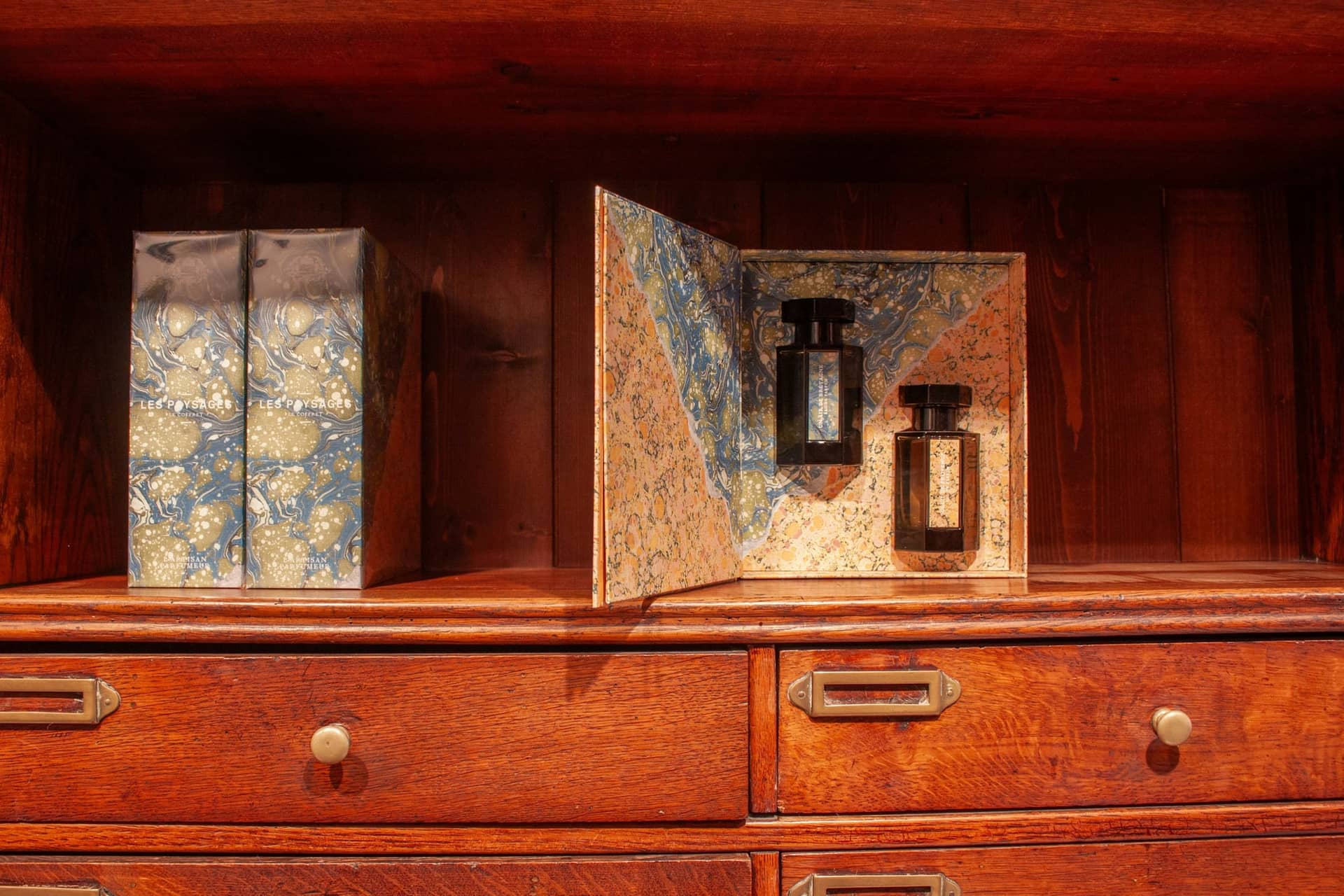
Short answer
Packaging has to do two opposite jobs at once. The front has to sell from a metre away, so it carries four things: brand, product, variant, benefit. The back has to comply in the hand, so it carries ingredients, directions, net contents, a barcode and the legal marks — legibly, on a surface that curves. Design them as two separate problems on one dieline.
Why packaging is a different job from a poster
A social media post exists on a screen, at a size you control, in a colour space that glows. Packaging exists in someone's hand. It has to communicate the brand, protect the product, present information clearly, photograph well for a listing, remain practical to produce, and survive a press and a supply chain.
That is a lot of constraints, and they arrive before the visual work rather than after it. Material, dimensions, print method, product category and production limits shape a packaging concept from the first sketch. Discovering them at the press is the expensive way to learn them.
Start with the dieline, never with a rectangle
A dieline is the flat plan of the pack: the cut line, the fold lines, the glue flap and the areas that will be hidden once it is assembled. Your printer or converter supplies it. Until it exists, there is no canvas — only a guess about one.
Three rules that save redraws:
- Keep the cutline on its own non-printing layer. It is a manufacturing instruction, not artwork.
- Treat fold lines as walls. Nothing important crosses a fold, because folding is never perfectly accurate.
- Respect the glue flap. Anything printed there disappears under adhesive.
On a bottle the equivalent constraint is curvature. A label wraps, so the outer thirds of the panel are read at an angle. Put the critical information in the middle third and the fine print outward, not the reverse.
Front of pack: four things, in order
Hierarchy on the front of a pack is brutal, because a buyer gives it about a second. In that second they want four answers, in this order:
- Brand — whose is it?
- Product — what is it?
- Variant — which one is it?
- Benefit — why this one?
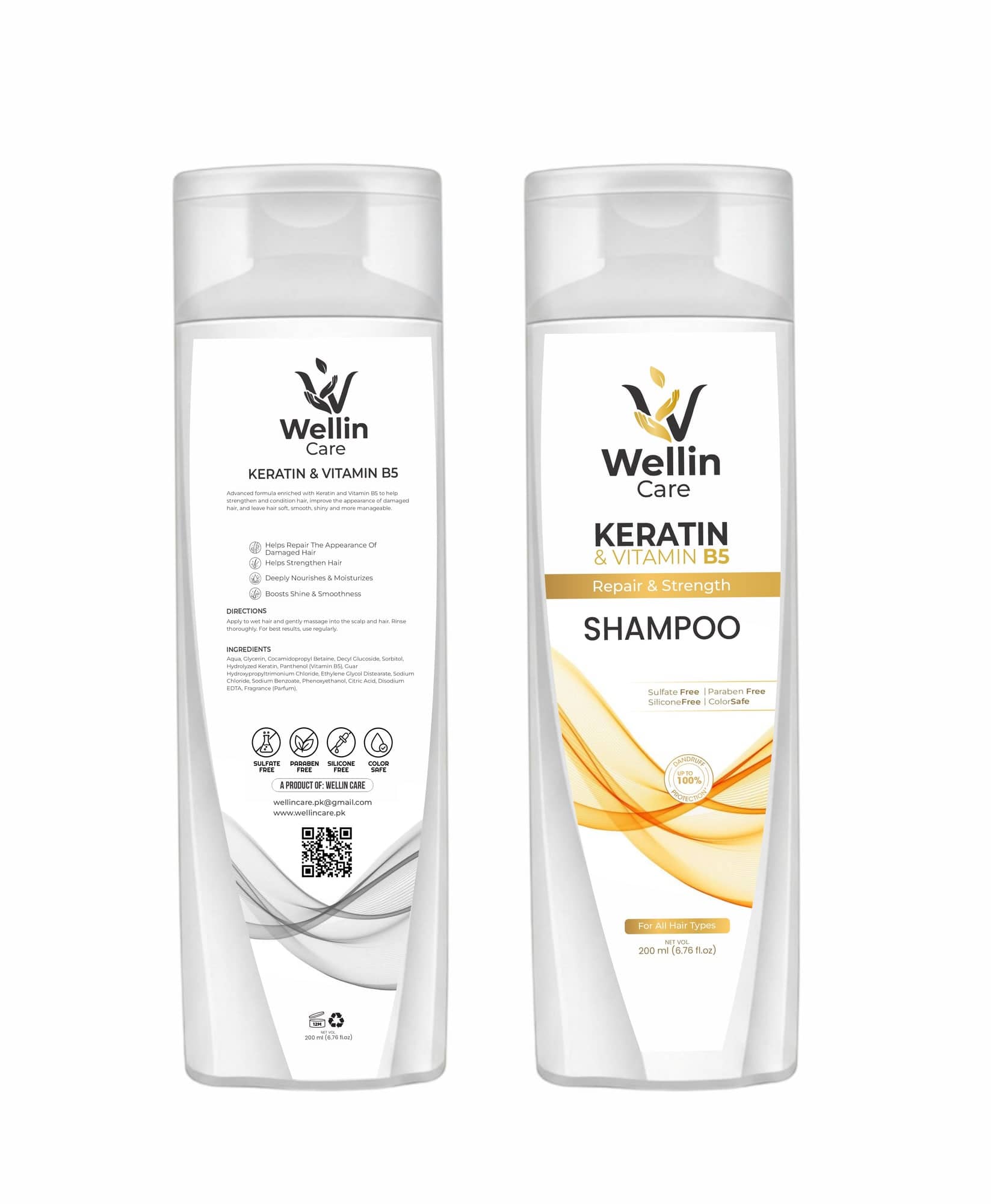
Anything beyond those four competes with them. A fifth claim does not add persuasion, it subtracts attention from the first four. On the Wellin Care bottle the front is the mark, "Keratin & Vitamin B5", "Shampoo", and "Repair & Strength" — and then it stops.
Back of pack: the unglamorous half
The back is where most packaging quietly fails, because it is treated as a dumping ground rather than a layout. It usually has to carry:
- Directions for use
- A full ingredient list
- Claims and their supporting icons
- Net contents and a batch or expiry field
- A barcode at full size with its quiet zone
- Recycling and period-after-opening marks
- Contact details, and often a QR code
Give it its own grid. Set the ingredient list as a single justified block rather than a ragged column, because it reads as a block anyway. Keep the icons on one baseline. And check the type size at the real dimensions of the pack, not zoomed in on a screen — the most common back-of-pack error is copy that was only ever read at 400%.
Design the range, not the pack
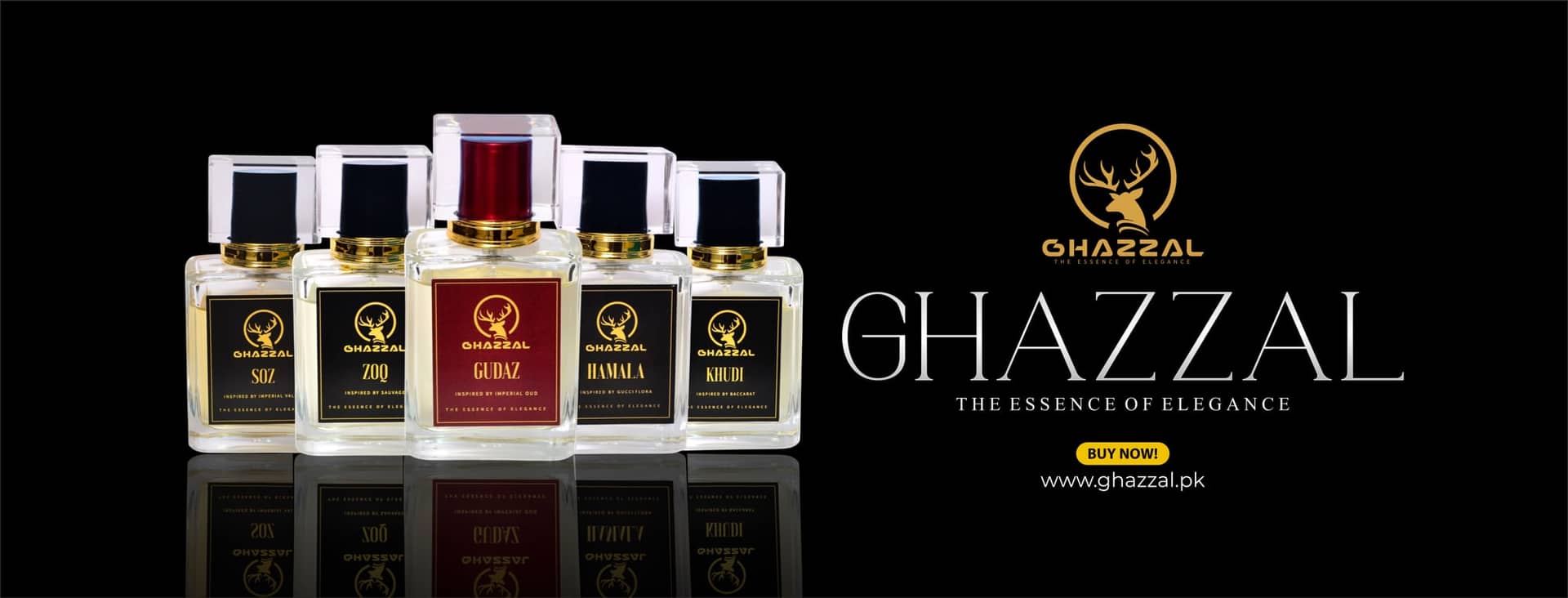
If you have more than one SKU, design the first one as a system. Decide which element carries the variant — usually one colour band and one word — and fix everything else. Then variant two is production, not a new project, and the shelf reads as a family.
This is also what makes the pack photograph well. A range that shares a structure photographs as a set, which is what a listing or a launch post actually needs.
Before you order: a short checklist
- Dieline received from the converter and artwork built on it
- Cutline on a separate non-printing layer
- Nothing critical across a fold or under the glue flap
- Ingredient and legal copy signed off by whoever is responsible for it
- Barcode at 100%, quiet zone clear, dark on light
- Smallest text checked at real pack size, not on screen
- CMYK separations checked, spot colours declared
- Bleed present on every edge that runs off
- A physical proof or sample approved before the full run
The last one matters most. Screens lie about colour and about scale. A printed sample costs a fraction of a run, and it is the only place where "it looked fine in the file" gets tested against reality.
FAQ
Questions people ask.
What do I need before packaging design can start?
The dieline from your printer or converter, the material and finish, the final copy including any regulatory text, and the barcode number. Designing before the dieline exists almost always means redrawing, because the fold, the glue flap and the curve of the pack all change where artwork can go.
How small can text be on a label?
As a working rule, nothing below 6pt on a flat label and nothing below 7pt where the label curves, because the curve eats legibility at the edges. Ingredient lists are the usual pressure point — if the copy will not fit at a readable size, the honest answer is that the panel is too small, not that the type should shrink.
Do I need a separate design for each variant?
No, and you should not have one. Design the first pack as a system with the variant rules decided — which element changes colour, which stays fixed, where the variant name sits — and the rest of the range becomes production rather than fresh design.
Why does the barcode have to be left alone?
A barcode is a scanning target, not a graphic. Scaled disproportionately, tinted, or printed without its quiet zone, it fails at the till. Place it at full size, keep the clear space around it, and print it dark on light — never light on dark.
From reading to doing
Want Kashif to handle this for you?