Blog · Event & org design
Inside SEE Oghi 2024: Designing a Student Expo Kit on a Volunteer Budget
 By Kashif RehmanPublished 17 September 2026Updated 17 September 20269 min read
Short answer
SEE Oghi 2024 was a one-day Student Educational Expo held on 14 December 2024 at the Main Hall, GHS Rasheeda, Oghi, organised by Islami Jamiat-e-Talaba Oghi. The studio built its full visual kit in CorelDraw: logo, stage backdrop, sponsors wall, competition standees, welcome wall, holdings and the main social post, all designed around local printing.
What was the brief for SEE Oghi 2024?
The organisers were students. They had a date, a venue, a list of competitions and a growing list of local sponsors, and they needed the event to look like one thing from the first social post to the stage on the day. There was no brand to inherit. The expo had never had a logo, so the kit had to start from nothing.
The practical brief, as I understood it, came down to a few needs:
- A logo that says "students" and "education" without needing an explanation, and that works small on a sponsor tile and large on a stage.
- A stage backdrop that photographs well, because most people would see the event through phone photos shared afterwards.
- A way to thank sponsors in public, on a wall people would stand in front of.
- Standees that tell visitors which competition is happening where.
- A social post with the date and venue that people could forward on WhatsApp.
Islami Jamiat-e-Talaba Oghi also needed its own mark to appear consistently, without competing with the expo logo.
What constraints shaped the design?
Every event job has constraints. These were the ones that decided most of my choices.
Volunteer budget. Student organisers raise money piece by piece, often from the same sponsors who then appear on the wall. That rules out special materials, custom finishes and anything that needs a second print run if it goes wrong. The design had to work on ordinary panaflex and ordinary paper.
Local printing. The pieces were going to press shops in the region, which work mostly from CDR files and print on large-format solvent machines. Colours on panaflex rarely match the screen exactly. Blues can go purple and light greens can go grey. I had to pick colours that would survive that drift.
Fast turnaround. Organisers confirm sponsors late, and every new sponsor changes the wall. Competition names get finalised close to the date. The system had to absorb late changes without redesigning pieces from scratch.
Many hands. Student committees have several people approving things, and sometimes nobody is sure who has the final word. Clear, simple artwork makes approval faster because there is less to argue about.
How did the logo come together?
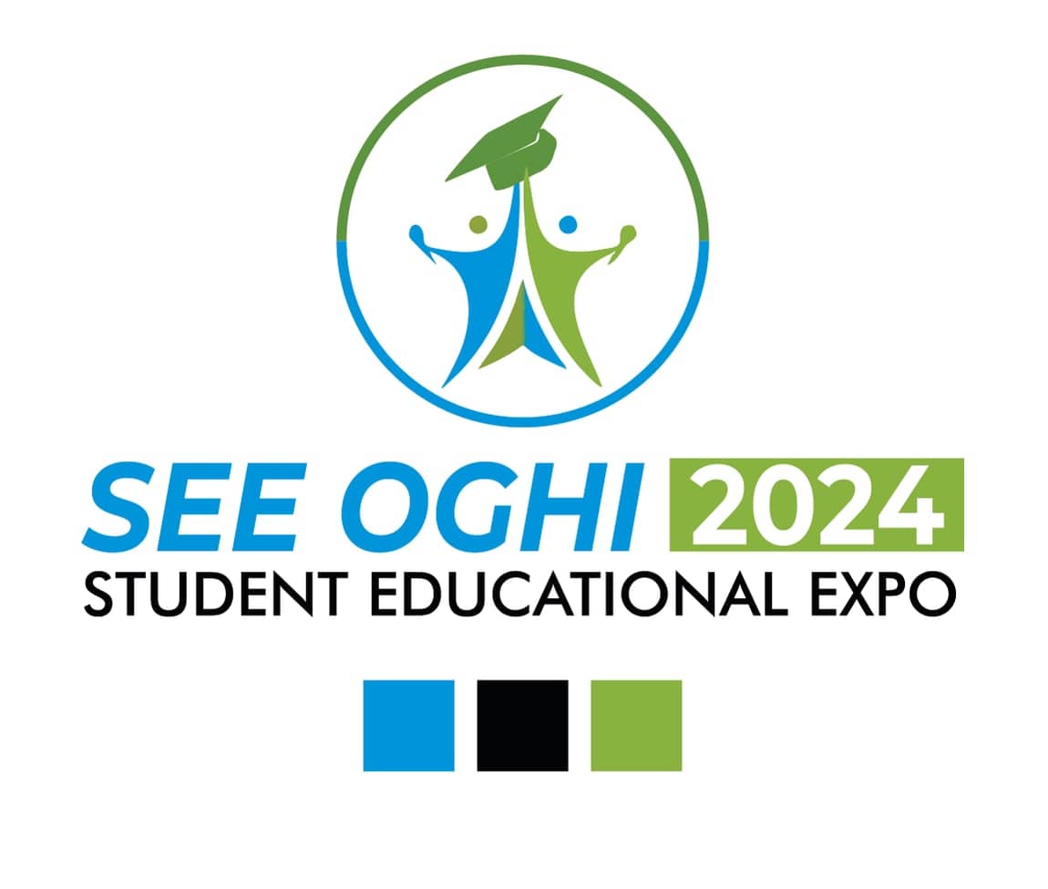
The mark is two figures, one blue and one green, with their arms raised. Their inner edges lean together and form a triangle that reads as a book spine or a path, and a green graduation cap sits at the top where they meet. The ring around them is split: green on the top half, blue on the bottom. It is a simple idea on purpose. Parents, teachers and students all recognise a mortarboard and two celebrating figures at a glance.
The wordmark sets "SEE OGHI" in a bold italic blue, with "2024" reversed out in white on a solid green block. "STUDENT EDUCATIONAL EXPO" runs underneath in black geometric capitals, spaced to match the width of the line above. Putting the year in its own block matters for a recurring event. Next year, only that block changes and the rest of the lockup stays.
The palette is three flat colours: a clear process blue, a leaf green and black. I kept them away from very light tints because tints are the first thing to wash out on panaflex. Black carries the descriptive line so the small text stays readable even when the colour print is a little off.
Why a soft blue field and a coloured wave?
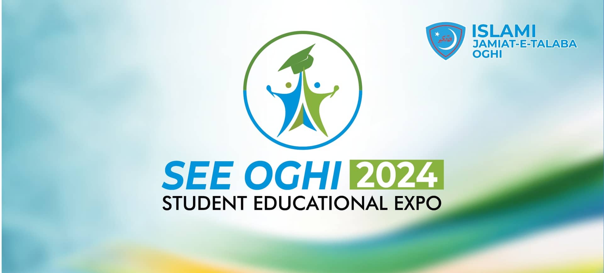
The logo was the identity. The background was the system. Every large piece uses the same treatment: a blurred, pale blue field that brightens to near white in the centre, with a soft wave of green, teal and a touch of yellow sweeping across a corner.
This did three jobs.
First, it kept the centre of every piece light, which gives the logo and any large type a clean area to sit on. On the backdrop, that also means the speakers and guests standing in front of it are not lost against a busy pattern.
Second, it hid printing problems. A flat, saturated background shows every band and roller mark on a large print. A soft gradient with blur is forgiving, and slight colour drift across a big sheet looks intentional.
Third, it made new pieces fast. Once the background existed as a master file, a new standee or holding was mostly a crop of that background plus the logo, a title and the organiser's shield.
On the backdrop, the organiser's shield and "ISLAMI JAMIAT-E-TALABA OGHI" sit in the top right corner in blue. That position leaves the centre to the expo and still puts the organiser's name in almost every stage photo.
How was the sponsors wall laid out?
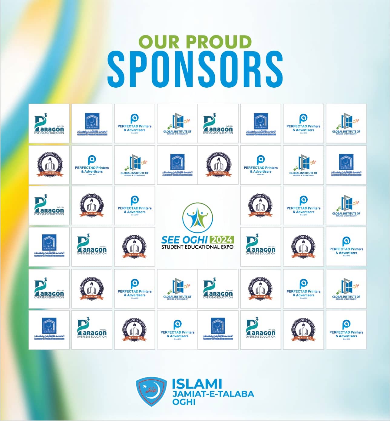
The wall headline stacks "OUR PROUD" in green over "SPONSORS" in a tall, condensed blue. Below it is a grid of white square tiles, eight across, with each sponsor logo on its own tile. The sponsor logos repeat across the grid in a staggered order, so no two identical tiles sit side by side. The expo logo takes a larger block in the centre, four tiles in size, and the IJT Oghi mark sits at the bottom.
Repeating logos is a step-and-repeat idea borrowed from media walls. It has a practical benefit at a student expo. Wherever someone stands for a photo, at least one of every sponsor usually ends up in frame. For sponsors who gave money to a local event, that is a fair return, and it costs nothing extra to print.
White tiles also solved a problem I see on almost every sponsors wall. Sponsors send logos in every format: low-resolution JPGs from WhatsApp, logos on coloured backgrounds, logos with their own borders. A uniform white tile gives each one the same neutral ground, so the wall looks orderly even when the source files are uneven.
What did the standees and welcome wall need to do?
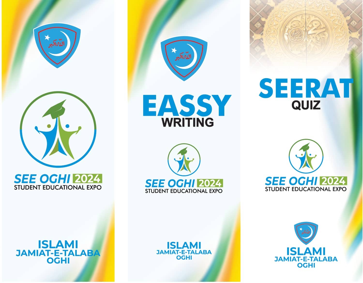
The standees were tall, narrow pieces for a hall where people move between competitions. Each one follows the same vertical order: a title or the organiser's shield at the top, the expo logo in the middle, and "ISLAMI JAMIAT-E-TALABA OGHI" at the bottom. The coloured wave runs along the side edges here, with yellow more visible than on the backdrop, which gives the narrow format some movement.
Competition names are set very large in bold blue capitals, with the second word in black underneath. From across a hall, a visitor only needs to read one word to know where to go. For the Seerat Quiz standee, I replaced the top of the background with a soft, faded gold ornamental image, which marks that competition's subject clearly and respectfully while the lower half stays in the shared system.
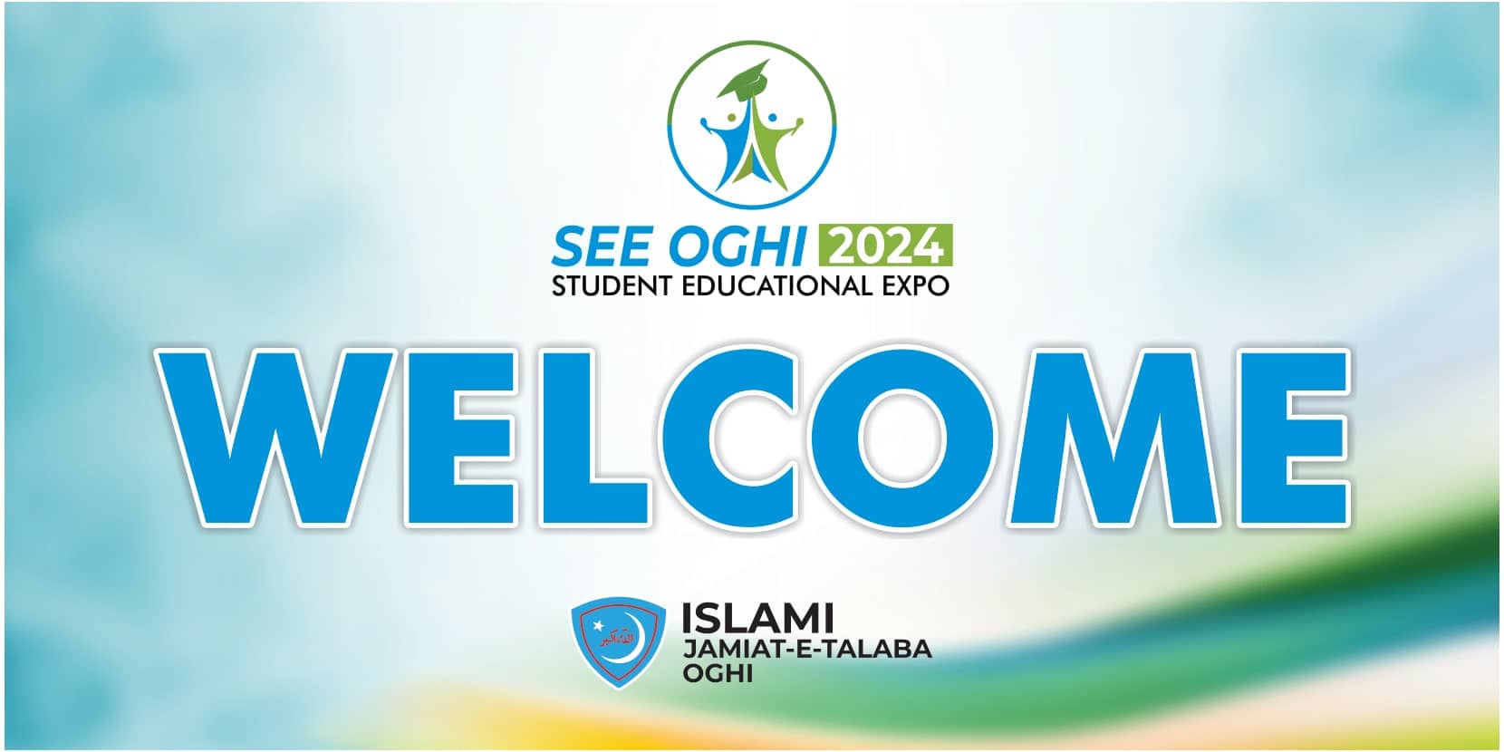
The welcome wall is the simplest piece in the kit. It uses the same pale blue field and wave, the expo logo at the top, the organiser's mark at the bottom, and "WELCOME" across the middle in heavy blue capitals with a thin white outline and a soft shadow. The outline lifts the word off the background when light hits the flex at an angle.
How did the main social post work?
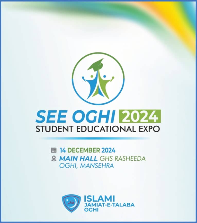
The social post carries only what someone forwarding it on WhatsApp needs: the logo, a thin blue rule, the date with a calendar icon, the venue with a location pin, and the organiser's mark. "14 DECEMBER 2024" is set in green. "MAIN HALL" is bold italic blue with "GHS RASHEEDA, OGHI, MANSEHRA" lighter beside and below it. The wave appears at the top corner this time, so the post is recognisably part of the same kit without repeating the backdrop layout.
I kept it portrait because it sits better in a feed and in a status view, and I kept the type large because many people would see it as a forwarded image, often compressed more than once.
What worked well?
Looking back, a few decisions carried the whole kit:
- One background, many crops. The shared blue field and wave made every piece feel related and made late additions quick.
- A small, print-safe palette. Three solid colours with black for small text held up better than a wider palette with light tints would have.
- A fixed home for the organiser's mark. Top right on the backdrop, bottom centre on most other pieces. It never fought with the expo logo.
- CorelDraw end to end. Files went to local printers in the format they already use, which removed a round of conversions and questions.
- A year block in the logo. The identity can return for another edition with a small change.
What would I change next time?
The honest list is short but useful.
Proofread display type separately. The Essay Writing standee went out with "EASSY" in its heading. Large type is the easiest place to miss a typo, because you stop reading it as letters and start seeing it as a shape. Next time, I would add a step where someone outside the design process reads every headline aloud from a printed proof before files go to the press.
Add Urdu. The kit is entirely in English. Oghi is a place where many parents and guests read Urdu more comfortably. An Urdu line on the welcome wall and the social post would have made the event more open to families.
Build a sponsor tile template on day one. Sponsor lists at student events keep growing until the last week, and every addition means rebalancing a grid. A fixed tile size with a clear rule for how many tiles each sponsor gets would make those updates mechanical.
Write a size sheet for the printer. A single page listing every piece with its finished size, material and quantity makes the handoff to the press cleaner, especially when several shops are involved. The event branding kit checklist covers that sheet in detail.
Checklist
Before your student expo files go to print
- Logo, colours and background fixed before any other piece is designed
- Every sponsor logo collected in vector, with a firm cut-off date
- All headlines read aloud from a printed proof by someone new to the job
- Urdu and English copy agreed by one named approver
- Fonts converted to curves in every CDR or PDF sent to the press
- A one-page size sheet with finished size, material and quantity for each piece
- Written quotes from at least two local printers, since panaflex rates vary by shop and material
Student events are some of the most rewarding jobs the studio takes on. The organisers care, the audience is local, and the work is seen on the stage, on the walls and on people's phones afterwards. A kit that is simple to print and simple to extend is what lets a small committee pull that off.
FAQ
Questions people ask.
What did the SEE Oghi 2024 design kit include?
The studio designed the expo logo with its blue, green and black palette, the stage backdrop, an "Our Proud Sponsors" banner wall, standees for the Essay Writing and Seerat Quiz competitions, a welcome wall, event holdings and the main social post announcing the date and venue. Posters and posts were built in CorelDraw.
Why was the SEE Oghi kit designed in CorelDraw?
Most press shops around Mansehra, Abbottabad and Rawalpindi work in CorelDraw and ask for CDR files. Designing in the same format meant the printer could open, check and resize files without conversion, which removes a common source of missing fonts, shifted artwork and last-minute phone calls when time is short.
How do you keep an expo kit consistent across many printed pieces?
Fix a small set of rules early: one logo lockup, three colours, one typeface family, one background treatment, and a standard spot for the organiser's mark. Every piece then becomes a layout exercise using those parts. On SEE Oghi, the soft blue field and the coloured wave did most of that work.
Can a student organisation afford a full event branding kit?
Usually yes, if the kit is planned around reuse. One master background, one logo and one type system can be adapted to backdrop, standees and posts quickly, and most pieces print on standard panaflex. Local panaflex rates vary by city and material, so organisers should collect written quotes from two or three printers first.
From reading to doing
Want Kashif to handle this for you?