Skip to content

Case 05 · Packaging Design

Wellin Care

A shampoo label that had to sell and comply at once.
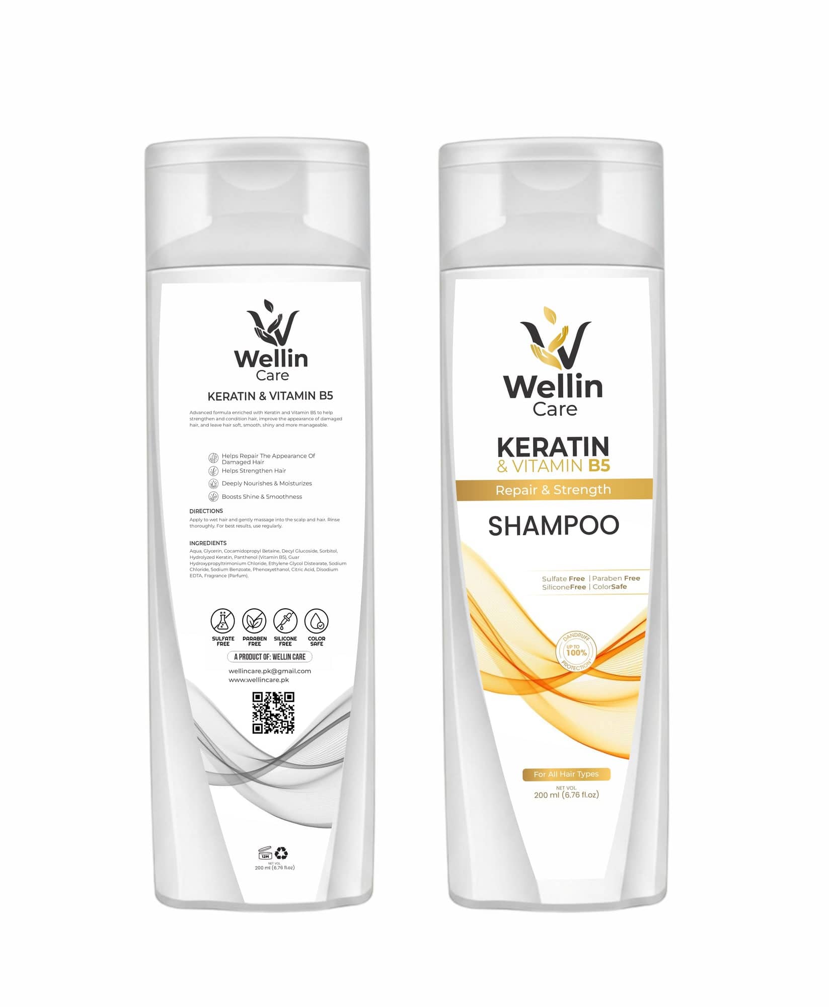
Wellin Care Keratin and Vitamin B5 shampoo shown front and back: the front carries the leaf mark, product name and a gold ribbon of waves, the back carries directions, the full ingredient list, four free-from icons and a QR code.
Client
Wellin Care SMC Pvt Ltd, Lahore
Year
2025
Scope
4 pieces · identity, packaging, stationery · 200ml bottle
Tools
CorelDRAW, Adobe Illustrator
Services
Packaging Design · Brand Identity · Print Design
Delivered
Logo · 200ml shampoo label, front and back · Letterhead · Visiting card

01 · The brief

A shampoo bottle has two faces and they want opposite things. The front has to sell at a metre on a shelf. The back has to carry ingredients, directions, free-from claims, a QR code, net volume and recycling marks — and still be readable in the hand.

02 · Constraints

  • 01One curved 200ml bottle, both faces on one dieline
  • 02Full INCI ingredient list at legible size
  • 03Claims — sulphate, paraben, silicone free, colour safe — needing icons and text
  • 04A wave device that had to work as both artwork and watermark

03 · Approach

Split the job

Front: mark, product, variant, benefit, in that order and nothing else. Back: everything else, on its own grid, at a size that survives the curve of the bottle.

A mark that means three things

The W is also a cupped hand and also two leaves. One shape, drawn as curves, so it reduces to a bottle cap.

The wave travels

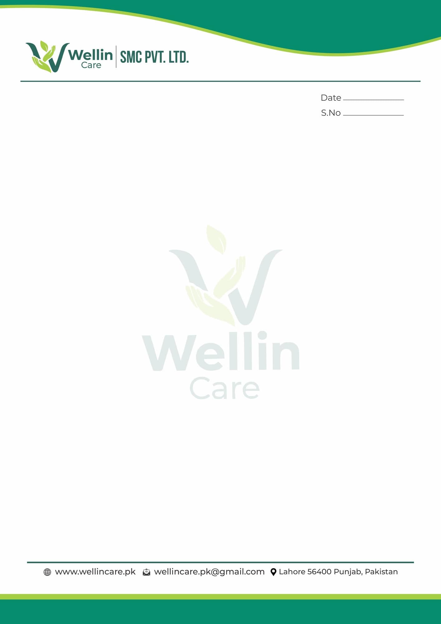
The gold wave from the label carries across to the letterhead and the visiting card, so the stationery is recognisably the same company as the bottle.

Built on the real dieline

Artwork produced on the converter's dieline with the cutline on its own non-printing layer.

04 · What was delivered

Logo, both label faces, letterhead and visiting card.

  • Logo
  • 200ml shampoo label, front and back
  • Letterhead
  • Visiting card

Planning something like this?

Tell Kashif the date. He’ll tell you if it fits.

Hire Kashif on WhatsApp on WhatsApp (opens in a new tab)
Wellin Care Keratin and Vitamin B5 shampoo shown front and back: the front carries the leaf mark, product name and a gold ribbon of waves, the back carries directions, the full ingredient list, four free-from icons and a QR code.
200 ml shampoo, both faces. Front sells, back complies — ingredients, directions, free-from icons, QR, net volume.
Wellin Care logo: a dark green W drawn as a cupped hand with two lime leaves growing from it, above the name set in two weights.
The mark. A W, a hand and a leaf in one shape.
Wellin Care letterhead with the logo and company name top left, a green wave across the head, a tinted watermark of the mark behind the body, and the Lahore address in the footer.
Letterhead. The wave from the bottle label carries across to the stationery.
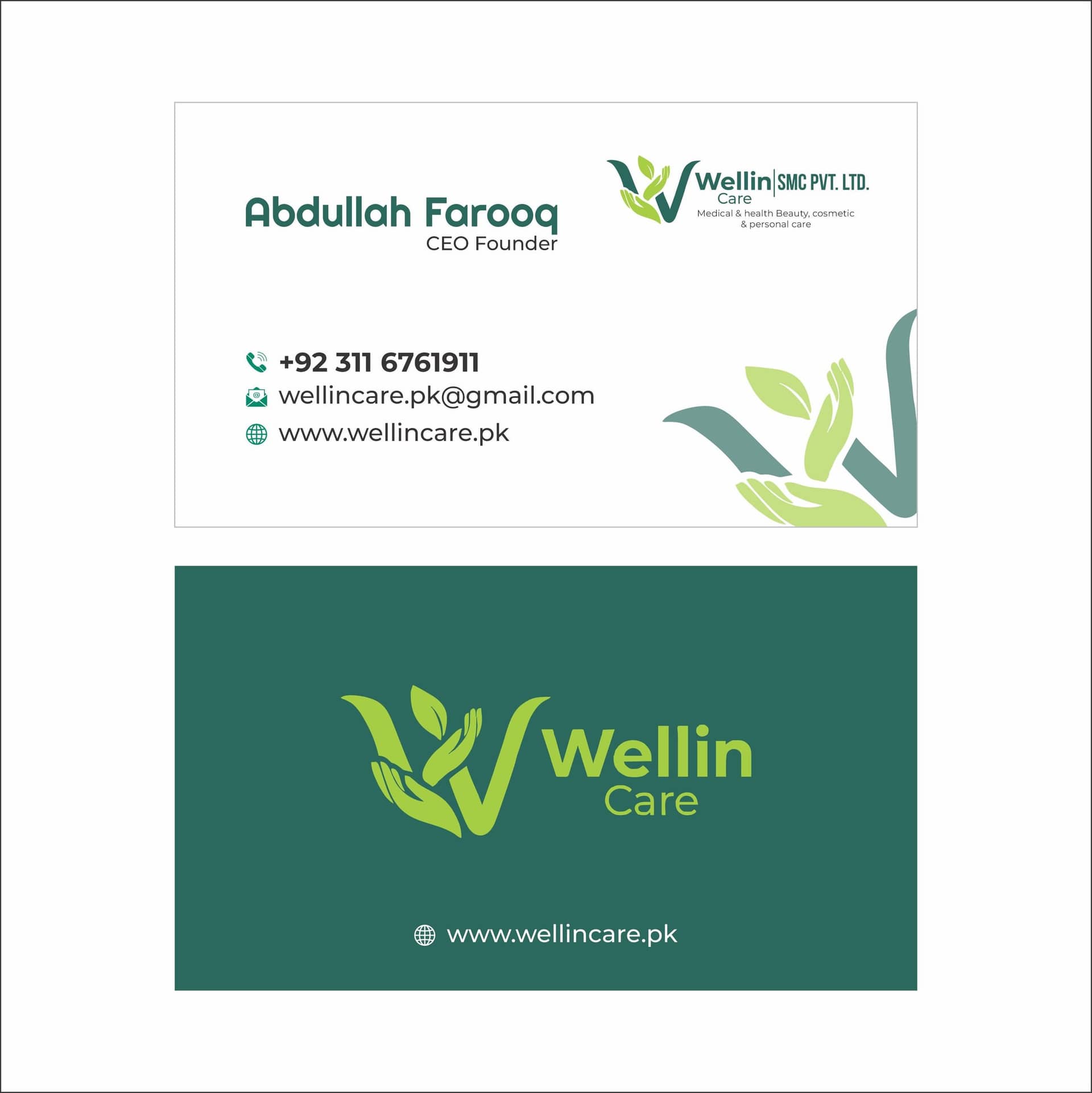
Wellin Care visiting card, front and back: the front carries the founder's name and contact details beside the logo, the back is solid green with the logo and web address reversed out.
Visiting card. Light front, solid green back.

06 · Result

A pack that reads as a product at shelf distance and as a compliant label in the hand, with a stationery set that matches it without a second design system.

Need something like this? Send the brief — replies within one business day.

07 · Questions

About this project

What has to go on the back of a cosmetic label?

Directions, the full ingredient list, claims with their icons, net volume, a batch or expiry field, recycling and period-after-opening marks, and often a QR. All of it legible at real size on a curved surface.

Can the same design cover the rest of the range?

Yes — that is how it was built. The variant rules are fixed, so a conditioner or a second size is production work rather than a new design.

Next case

Campaign NMIQ

National Mohsin-e-Insaniyat Quiz Competition

Start a projectCall