Draw the title, don't type it
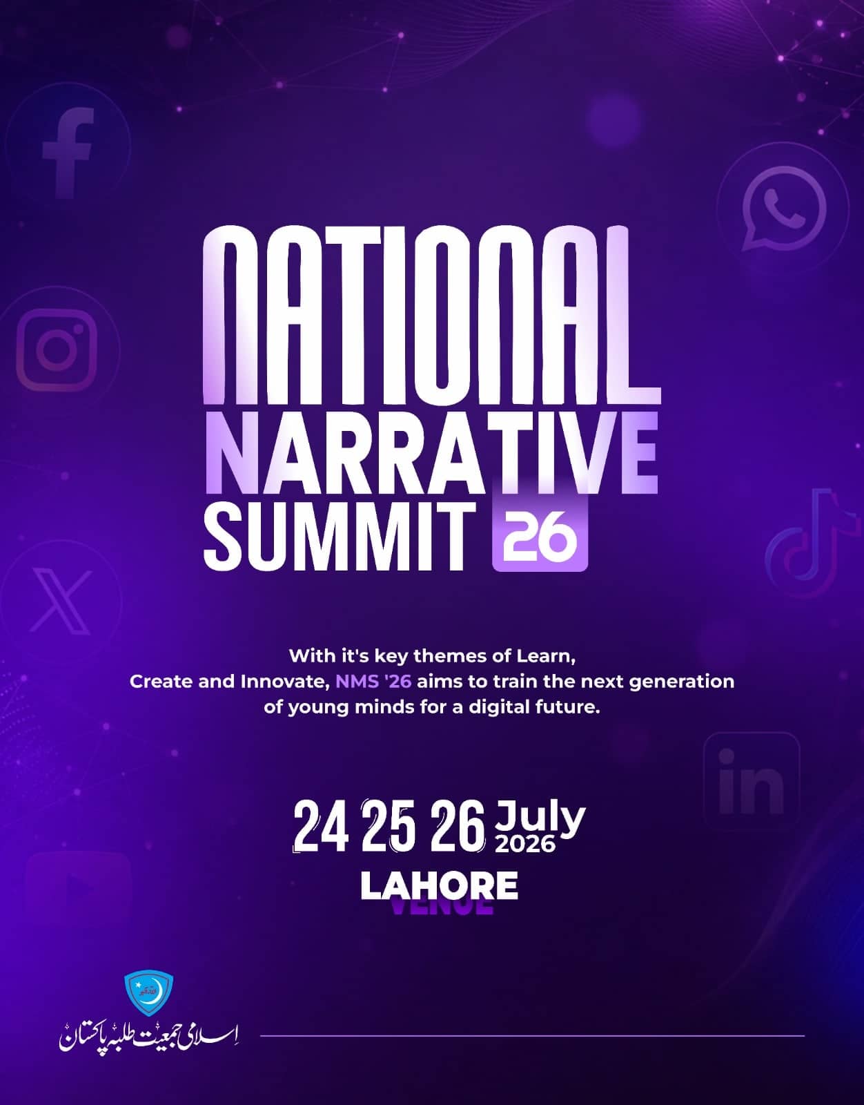
NATIONAL / NARRATIVE / SUMMIT 26 is drawn as interlocking stacked letterforms with a metallic gradient, so the summit has a mark that can be reused rather than a headline that must be reset.
Case 04 · Event & Expo Branding
A three-day summit with a mark of its own.
01 · The brief
A summit about digital platforms needed to look like it belonged on them — without becoming another gradient poster with stock icons behind it.
02 · Constraints
03 · Approach
NATIONAL / NARRATIVE / SUMMIT 26 is drawn as interlocking stacked letterforms with a metallic gradient, so the summit has a mark that can be reused rather than a headline that must be reset.
Deep purple was chosen because nothing else in the organisation's feed uses it. The summit is instantly separable from the parent brand.
The social platform marks sit at low contrast as background texture, signalling the subject without illustrating it literally.
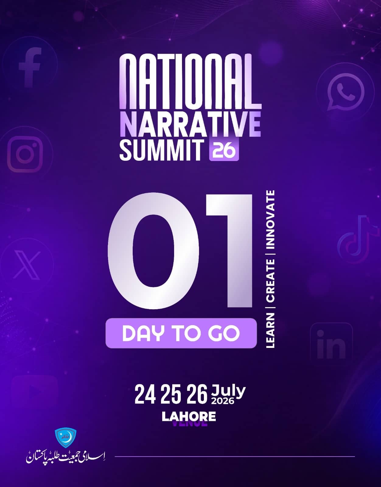
Countdown posts give the numeral the whole frame. Everything else is a caption to it.
04 · What was delivered
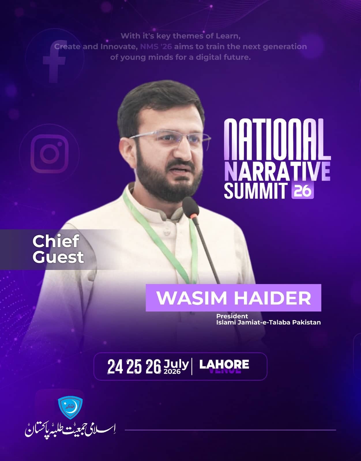
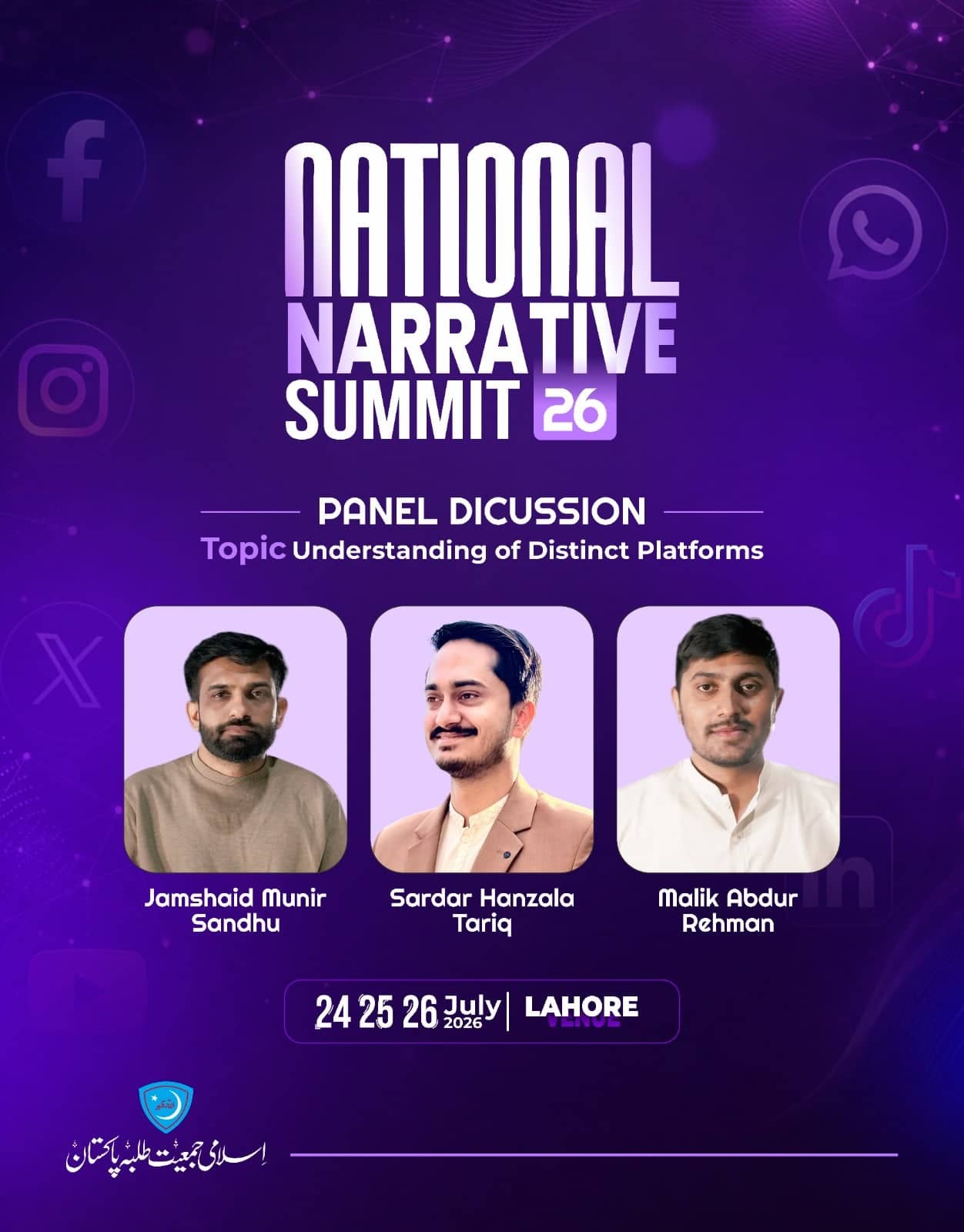
Summit logotype, announcement, chief guest and panel cards, and the countdown series.
Planning something like this?
Tell Kashif the date. He’ll tell you if it fits.
05 · Gallery
06 · Result
A summit mark that survives being shrunk to a profile picture and blown up to a stage backdrop, and a countdown that needed no new design each day.
Need something like this? Send the brief — replies within one business day.
07 · Questions
Because a summit needs a mark it can reuse, not a headline that has to be reset every time. The three interlocking lines work as a logo — at profile-picture size and at backdrop size.
By looking at what the organisation already publishes. Everything in that feed is green, so the summit took deep purple and became instantly separable from its parent brand.
Next case
Wellin Care
Wellin Care SMC Pvt Ltd, Lahore