The lettering is the logo
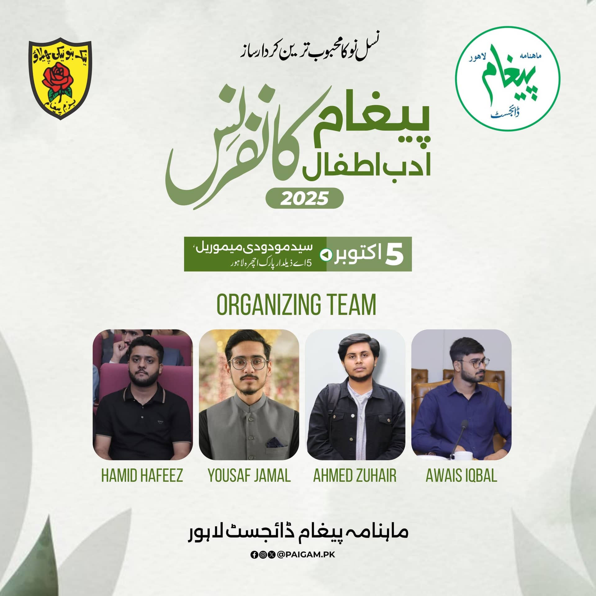
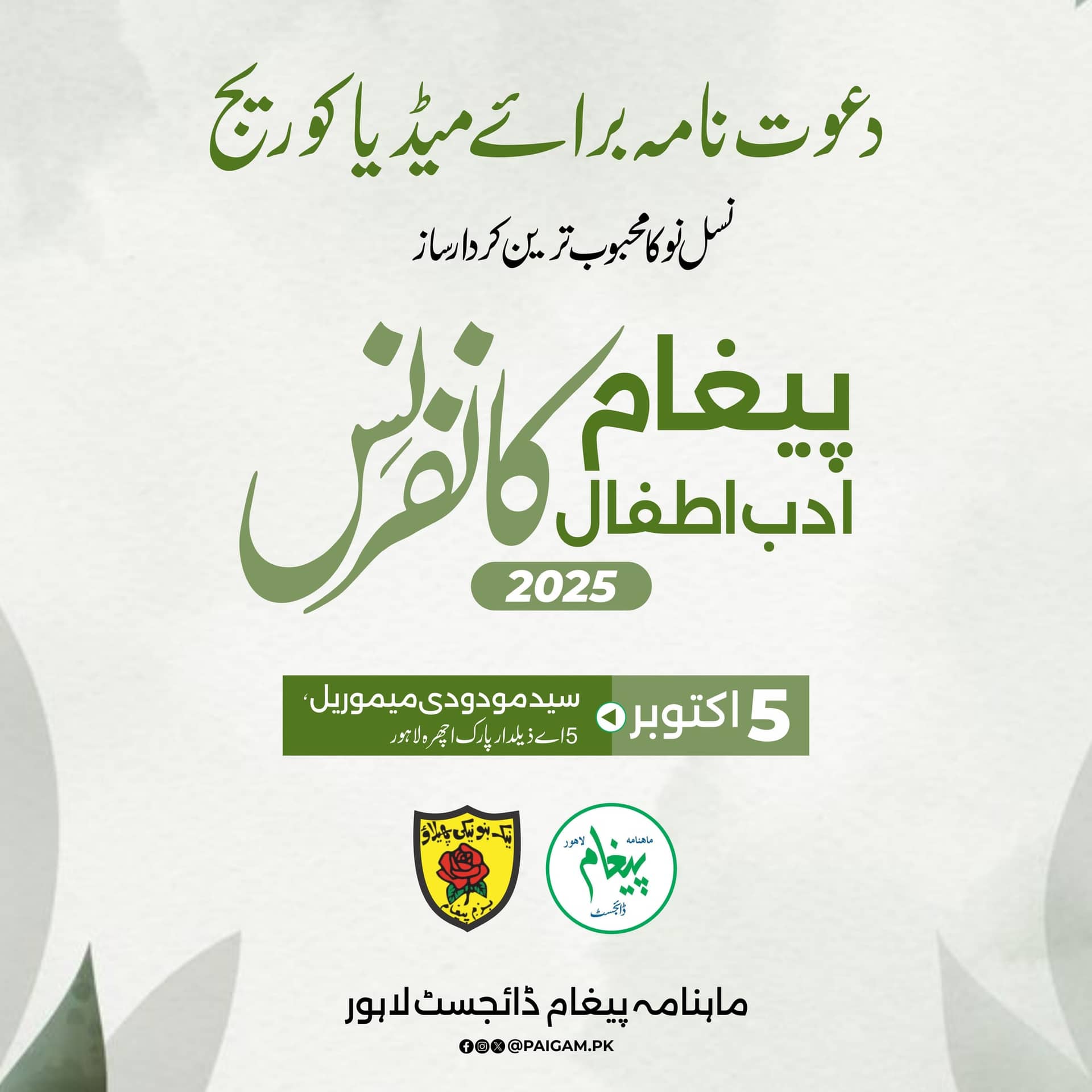
The conference title is drawn in green brush lettering and reused unchanged across all three assets, so it functions as a mark.
Case 10 · Event & Expo Branding
An Urdu conference identity.
01 · The brief
An Urdu literary conference where the title itself had to be the identity — no logo, no key visual, just lettering strong enough to carry three assets.
02 · Constraints
03 · Approach
The conference title is drawn in green brush lettering and reused unchanged across all three assets, so it functions as a mark.
A pale textured ground keeps a literary event from looking like a campaign, and lets the green lettering carry all the contrast.
The media invitation uses no photography. Hierarchy alone — title, date, venue, host — does the work.
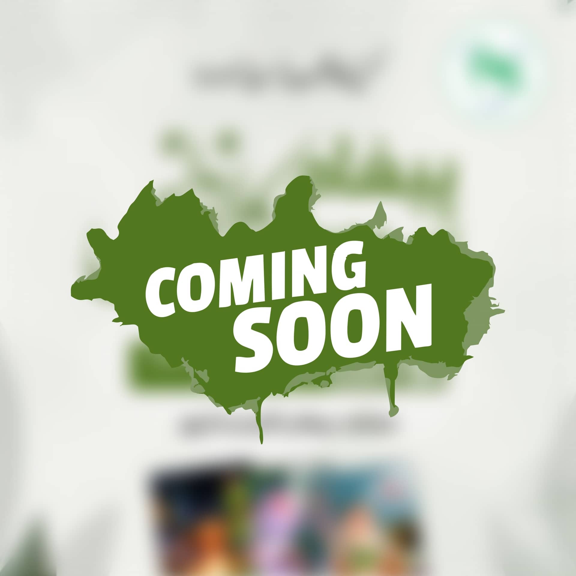
The teaser is the finished poster, blurred, with a single brush stroke over it. No separate artwork needed.
04 · What was delivered
Conference lettering, media invitation, organising team post and teaser.
Planning something like this?
Tell Kashif the date. He’ll tell you if it fits.
05 · Gallery
06 · Result
A conference that reads as one piece of typography across every asset, with a teaser produced from the artwork it was teasing.
Need something like this? Send the brief — replies within one business day.
07 · Questions
Yes. The conference title was drawn as brush lettering and reused unchanged across all three assets, which is exactly what a mark does — it becomes recognisable by repetition.
Because hierarchy alone was enough. Title, date, venue, host — a literary event reads as more serious without a photograph competing with the lettering.
Next case
HHRD Mansehra
Helping Hand for Relief and Development, Mansehra